Artist Fundamentals Series
I thought it would be helpful to have art technique tips, downloads, articles, and videos to help you with your art journey. I am hoping these art fundamentals will help you if you do not have previous art experience or you want to learn more about some of the techniques. We will be offering some FREE instructional videos and worksheets to help bridge the gap before taking one of our longer classes.
I never wish for you to strictly follow the fundamentals or rules of traditional art techniques that would be far too boring…but I find when you know some of the foundations, you can work more freely and confidently and learn how to “break the rules” and build your own style.
Start to Finish - How to Prep and Finalize your Artwork
There are so many products out there it can be so overwhelming! I will included my most used products but you will need to experiment on which product and brand works best with your practice. Here are some basics for those of you new to art. Priming is creating a barrier between your medium (paint, pencil, pastels etc.) and the substrate (paper, canvas, wood panel etc.). Fixatives and varnishes finalize the piece. They are a clear coat in various finishes (flat, matte, semi-gloss, gloss) that stabilize the pigments and help protect your artwork. Both are necessary to help preserve your artwork!
So how do you start a piece? How do you turn your idea into reality?
I find the most important way to start is to….START! Simple right? Easier said than done BUT I think sometimes we wait for the BIG IDEA and then we keep waiting. Sometimes, just putting a pen or paintbrush to canvas and letting our instincts guide us we will be pleasantly surprised with the results. Worst case scenario, you are practicing! On the days in which I feel inspired, I jot down notes whether on scraps of a paper or digitally on a note pad of anything that inspires me. I also collect images online, magazine clippings, elements from nature and put them in a bowl in my studio. I go back to that idea bowl or list often on the days I am feeling uninspired. Some days the notes have meaning, other times they don’t but they always seem to spark something even on the cloudiest creative days.
What to do when you finish your piece?
You will want to put a fixative or varnish on the piece.
Next, decide if you want to frame your piece. If so, do you want a simple modern frame or more of an ornate frame to finish the piece? Don’t know where to start you can use online tools to see your piece in various frames OR go to your local framing shop and ask for advise. Remember to wire your piece so it is ready to hang.
Take a high quality photo of your piece with a clean background.
Name your piece! Get creative here!
Record the details of your piece - dimensions, medium, name
Add your piece to your website!
Market your piece on social media, in your newsletter, or share with collectors
Knowing when a piece is finished?
To be honest, you could think it is never complete but chances are at some point you have to say it is done! Here are some tips to help me decide if it is complete or as close to finished as I will get!
Look at the piece from a different perspective or angle. Does it look different on a flat surface versus the wall?
Take a photograph of your work. I find that sometimes the view of a camera lens is different than my eye. I find areas that need more contrast, a feature that is off in a portrait, or the perspective slightly off in a landscape.
Ask a friend. Another point of view is always beneficial. You don’t have to ask just artists friends either. Sometimes the best perspective is from someone outside the art field.
My Favorite Products to Begin and Finish Your Piece
Golden’s Archival Varnish Mineral Spirit Acrylic - (Used over a wide variety of paints, including acrylic, oil, alkyd, watercolor, and casein)
Winsor & Newton Spray Varnish Satin Finish
Latour Sennelier Fixatif (There are a variety of options for pastels, pencils, and charcoals)
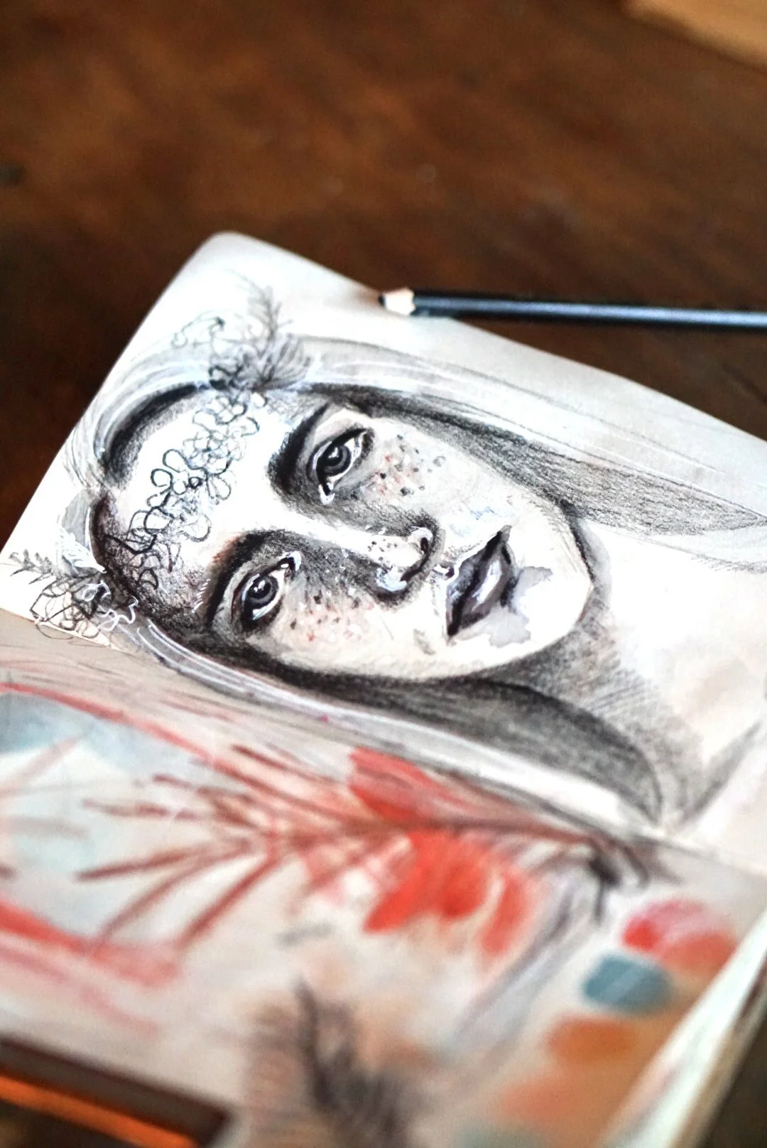
Portrait Basics
Portrait drawing and painting can be overwhelming when you first start. Through this lesson, we will discuss some basic ways to measure and map out the face, discuss warm up exercises to get you more relaxed, and talk about ways to bring personality and emotion to your portrait.
BRINGING IN PERSONALITY & EMOTION
We all focus on the appearance of our portrait, the proportions, the shading, the line etc. Although these are very important, the heart of a portrait is the person’s personality and emotion. As an artist, how do you convey the person’s personality through your work? Whether you are working from a photograph of someone you don’t know or a commissioned piece of a good friend you want to really think about the feeling the viewer gets from your portrait. Do you want them to feel joy, sorrow, reflection, romance? You can allow the emotions to come through in your portrait in various ways. The selection of materials used, the composition of the piece, the angle of the face, your choice of line and movement, the clothing the person is wearing, or the colors used. The goal is to have the viewer engage and connect to the subject matter.
PHOTO RESOURCES
Start with some photographs from a variety of angles. If you are just starting with portrait work, I would suggest working on a straight on view. You can find resource photos in magazines, on Pinterest or you can take your own photos of friends and family members or draw from life. I love working from my own photographs or royalty free ones from Unsplash. To access my portrait folder on Unsplash visit the link below. I love to bring my own emotion and style into the drawing to really make it different than the photograph.


HOW TO START?
I like to start by measuring the face from hairline to chin and from temple to temple. I do this by drawing axis lines horizontally and vertically down the face. These proportions will vary depending on the angle or view point of the face but they will serve as a guide before you map in your features. You can place a piece of tape on a ball horizontally and vertically to better understand what happens to the features when the head is tilted in a different position.
MAPPING IN YOUR FEATURES
You can break the face into thirds from hairline to eyebrow, eyebrow to nose, and nose to chin. Personally, I like to start measuring the middle of the eyes to the bottom of the nose, the nose to the center line of the mouth. Horizontally, I will measure the distance from temple to the edge of your eye and then the width of your eye. Generally, you have one eye length distance in between both eyes. Next, you can measure the width of the nose as well as the mouth. This will vary depending on subject matter and the view point. The edge of most people’s noses goes to the corner of your eye and the edge of your mouth to the inner part of your iris.
PORTRAIT EXERCISES
Practice, practice and more practice! Keep a journal in your purse and draw whenever you can. I have a few favorite portrait exercises to help ease me into the process. I love to practice contour drawings (draw the face without lifting the pencil), work with your non-dominant hand or blindly (don’t look at your paper at all), value sketches where you work with just the shadow and light of the face, draw the face in shapes, or trace directly onto the photograph or with tracing paper to get a better feel of the person’s features.
Tips for your next Art Exhibition
Whether you are showing in an art gallery, an exhibition, selling online or sharing your artwork with a friend…putting yourself and work out into the world can be scary. It's ok to feel contradictory emotions. You can feel both excited and scared, joyous and resistant, grateful and you name it! If I can make any suggestion, feel all the feels BUT remember to keep creating.
Below is some information about my upcoming exhibition at G44 Gallery as well as some tips on how you can prepare for your own art exhibition.
From Concept to Canvas
Do you ever struggle with getting your ideas from your head to the paper or canvas? You have everything you want to create in your mind but you just can't figure out HOW to put these ideas down?
I do too! Recently, I felt stuck on a project. I had all these ideas brewing and did not even know how to start. So I stepped back and practiced some techniques I have learned over time to help me launch forward. Watch the video below for more tips!


Behind the Palette - Color Theory, Symbolism, & Harmony
There is a story behind a person’s palette. Colors can have a large impact on both the artist creating the work and the viewer observing. Color can connect to a specific emotion or memory or can have symbolic or deeper meaning. Use of color as an artist is so important. We can use it to leverage our ideas and convey something deeper. By adding bold contrast or subtle harmony you can change the way your piece feels.
Through this video, I will address some of the basic color theory principles, go into detail about my process of combining colors, how I use color in my own style, and ideas on where you can find inspiration for your palette.
Color Meaning Exercises
Each of us sees colors differently. Our environments and experiences can have an influence on how we react to certain colors. In order to connect your personal meaning behind each color, I encourage you to put each primary and secondary color onto a journal spread or sheet of paper. You can either paint/draw or collage the colors onto the page using any medium of your choice. Then, write down everything that comes to mind when you think of that color. For example: Blue - ocean, water, peace, serenity, calm, fluid, cold etc. Once you have a list, you can start breaking down where those meanings come from. Are they based on your memories? Do they come from what society taught you? Are they based on your surroundings or environment? Do they have cultural or religious meaning to you? Once you start seeing colors as more than just pigments, you can start to use them in your work in a powerful way.
Color Theory Basics
Color theory is an essential part of being an artist or a creative of any type. The principles of color theory can help guide you through your art journey. There are countless books on color theory that can be helpful throughout the process that I will list below if you want to further your research and understanding. You don’t need to know every single principle but it is helpful to know some of the basics so that you can create color combinations that are impactful in your own work and are unique to your own style.
COLOR WHEEL
Sir Isaac Newton developed the first circular diagram of colors in 1666 and is used by many today as a guide. **Purchase Color Wheel HERE
WARM VS. COOL COLORS
Warm colors consist of reds, oranges, yellows and warm greens and cool colors are blues, greens, violets (purples). You can split the color wheel below to have a better understanding of warm and cool colors.

PRIMARY COLORS
The three primary colors are red, yellow and blue.
SECONDARY COLORS
The secondary colors are orange, green, and purple.
TERTIARY
There are six tertiary colors yellow-orange, red-orange, red-violet, blue-violet, blue-green, and yellow-green.

ANALOGOUS
Analogous colors are next to each other on the color wheel.
COMPLEMENTARY
Colors opposite each other on the color wheel. For example: red and green, blue and orange, yellow and purple.
TRIADIC
Three colors spaced evenly on the color wheel to create a triangle.


Books on Color Theory
There are so many amazing resources out there that can aide you in the process. Below are a few of my favorites on color theory.